Combining vaporizers and web technology is no easy task, which is why we’ve spent countless hours hunched over our keyboards making it happen. The end result? Our website, this blog, and our other sites and online profiles – all about vapes, all created using modern technology. We wanted to showcase some of this work that we’ve done in the digital space to share our thoughts on vapes and vaping in general so we slapped together a portfolio on Behance that we’re taking a moment here on our blog to tell you about.
The first thing we shared on our Behance portfolio was our homepage. We snapped a screen shot of our website’s homepage and uploaded it to Behance along with a description and explanation. We described what it was we were showing the community: a vaporizer website making use of a lot of white space to place emphasis on the site’s content itself. We also explained why we went with the design, which we just mentioned in part – to place the focus of visitors on our site’s content and not on its design. Why? Because in the end, our goal is to share very specific information and we want our readers engaged with what we’ve shared with them. So instead of distracting our visitors with a flashy website design, we went with flashy content and a simple design. This way, the content — our images, videos, articles, etc — is what pops out, not the design.
While we didn’t show the entire homepage of our site in the screen shot we uploaded and shared, we did capture the top segment which shows the featured slider, the floating top bar, and more. This still leaves something to the viewer’s imagination, but for those who want to see more, there’s obviously always the option of visiting our site to see what it looks like. But we made a mistake when we shared this, we didn’t realize we were showing the HTTP version (non-SSL) of our site instead of the HTTPS (SSL secured) version of our site. This really doesn’t make a difference but we do want people to realize that our site uses SSL to encrypt data, making it that much more secure than those that don’t. This isn’t necessary for sites like ours because we’re not transferring any important information but we wanted to make a point to keep the security and privacy of our visitors in mind when we put our site together so we opted for SSL. But enough of all that, here’s a screen shot of the project as seen on Behance where we shared it:

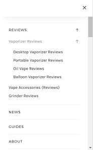
The next part of our project we shared on our Behance portfolio was the site’s popup menu. This isn’t really anything special, just a clean, simple menu that’s cross-platform compatible. It’s functional and it looks good. Or at least, that’s our take on it. We included in this menu some links to the different sections of our site like the vaporizer reviews section, the portable vaporizer reviews, and so on. There are also links to sections of our site that are pretty standard today such as a link to our about page, contact page, privacy policy, and all that. There’s also a little widget that shows our top rated vape products (those which we bestowed upon our highest ratings). We say “vape products” because it’s actually a mix of both vaporizers as well as vaporizer accessories. Basically, all of the main sections of the site are contained within this pop-out menu and that’s what we wanted to showcase: our simple but effective menu. As of the time we wrote this blog post, our menu had received one thumbs up on Behance, which is similar to a “like” on Facebook. Yay, go us! Team Vaporizer Shark for the win!
Also, as you can see in the screen shot of the menu to the right, we also have links to the vape news and vape guides sections of the site. We wanted to mention those because between those two and the vape reviews section, that’s basically what our site is all about. Those are the three main categories that all of our site’s content falls into. Obviously, the site is 100% about vaping, which is exactly what we intended from the start.
Then there’s the third piece of the puzzle that we shared, which is actually our Pax 1 vaporizer review page. We wanted to not only share one of the meaty pages of our site, but also one that had a original photograph taken by us. In this case, it’s a photo of the original Pax. In the screen shot we shared of the page, you can see the way that by using a lot of white and grey, we’re able to highlight things by simply making them black. We add more emphasis by making the items bold, as is the case with a lot of the links on our site and the social sharing icons that float to the side of each page. We also noted in our description of the screen shot that the social buttons actually move to right below the image and right before the text of the article when these types of pages of our site are viewed on mobile devices. You can see the screen shot of what we’re talking about below.

Currently, it is this glimpse of our Pax review that has received the most thumbs up on Behance, as it raked in a total of 3 thumbs up at the time we wrote this. While not super impressive, we’re happy because the ratio of views to likes is really good. In this case, out of 5 views, it received 3 likes. So most of the people that have seen have liked it. We like it too so that makes us happy! Yay, happy Vaporizer Shark!
And then there’s the last thing that we shared: the speed review part of our reviews. We wanted to showcase this because we’re actually really proud of what we’ve managed to do, which is to make it easy for our visitors to quickly see what it is exactly that we think about a vape without having to read too deep into it. We did this to save time for those who are lazy and for those who just don’t have the time to read our entire reviews because, we get it, they’re long. But for those who do want the whole picture and not just some quick summary, there’s always the option of reading everything we have to say. But this speed review makes it easy to get in and get out with the information you’re after. And we make a point to place these review summaries near the top of each review so there’s no scrolling to find it – it’s right there in front of you. Everything you want to know all in one place. Making information accessible and easy to access are two different things, but in this case, we handle both sides of that equation with grace and elegance (or so we like to think). You can see the way this looks by taking a look at the screen shot below – it’s the same one that we shared on our portfolio.

That sums up this post. It might not seem like much, but this is what we’ve managed to create as far as our vaporizer website is concerned. If you ask us, we’ve done an excellent job! But the real question is, what do you think?
